So, you’re looking to figure out the aspect ratio for your media, huh? It’s easier than you might think! Just punch in the width and height of your image or video and—boom!—you’ve got your aspect ratio. We’re talkin’ pixels, inches, meters, or any other units you can think of, as long as they’re for two-dimensional stuff like those fancy video wall panels or LED screens.
First off, lemme tell ya, understanding aspect ratios can save you from a lot of headaches. I mean, who wants stretched or squished visuals, right? Whether you're prepping content for your socials, fine-tuning a PowerPoint slide, or setting up a mobile LED screen for an event, knowing your aspect ratios can make or break the quality of your display.
Here’s the lowdown: aspect ratios usually get written as W (width) to H (height). For those of us who like to keep things simple (count me in), they can also be shown as N:1. Our tool does the math for you and gives you both versions. Easy-peasy!
This isn’t just some one-trick pony. Nope, our calculator works for all sorts of media formats. We’ve got you covered whether it's mobile screens, rental LED displays, TVs, images, videos—you name it. Trying to maintain that cinematic 16:9 widescreen vibe? Need to keep that classic 4:3 ratio for a retro feel? Or maybe you’ve got a custom size you’re dealing with. Our tool’s got your back.
Let me tell ya, this calculator saved my bacon more times than I can count. I remember this one time, I was setting up for a small concert, y'know, with those huge LED panels? I had to make sure everything looked just right. Messed up aspect ratios would have been a disaster in front of a live audience! This nifty tool made it so much easier to ensure everything was spot-on, and the show went off without a hitch.
So there you have it. No more guessing, no more trial and error. Just pure, efficient ratio-calculating goodness. Try it out next time you’ve got a project, and thank me later!
So, you might’ve heard about aspect ratios. But what exactly are they, and why do they matter? Buckle up, we're about to take a fun ride into the world of aspect ratios, where width and height collide to create visual harmony.
Alright, here’s the lowdown. An aspect ratio is basically the relationship between an object's width and height. Imagine you’ve got a rectangle. Its aspect ratio would be written like this: W:H. Here, "W" is your width, and "H" is your height. Pretty straightforward, right?
But in the realms of media and design, this simple ratio is kinda like the secret sauce. It's critical for achieving that sweet visual balance whether you’re dealing with digital images, videos, or even display screens.
Let’s get nifty with numbers. Aspect ratios can also look like N:1, where N is simply the width divided by the height (W/H). This formula helps you tweak dimensions while keeping everything in proportion.
Take the popular 16:9 aspect ratio. Well, it's not just a random pair of numbers. You can break it down to 1.78:1 (yep, 16 divided by 9 equals roughly 1.78). This ratio is super common in high-def displays – think your flat-screen TV or computer monitor.
Usually, we talk aspect ratios in pixels – that’s the tiny dots making up your screen image. But here’s the twist: you can express aspect ratios in other units too, like inches, feet, or meters. Heck, even in LED panels and those itty-bitty microstructures in metrology!
Fed up with dodgy proportions in your media projects? This is where the Aspect Ratio Calculator comes to the rescue. It's a nifty tool that helps you keep your dimensions spot on across various formats. Trust me, it’s a lifesaver for anyone juggling multiple media types.
Now, let me tell ya a little story. I once tried to make a slideshow for a family gathering – sounds easy, right? Wrong! The images were either stretched out weird or squished. Until I got to grips with aspect ratios. Bingo! Everything looked just like it was supposed to. Seriously, knowing about aspect ratios is like having a superpower in your digital toolbox.
So there you have it – aspect ratios, demystified. Whether you’re a media geek like me or just trying to get your holiday photos right, understanding aspect ratios will make your life so much easier. And, who knows, you might just impress a few folks with your newfound knowledge!
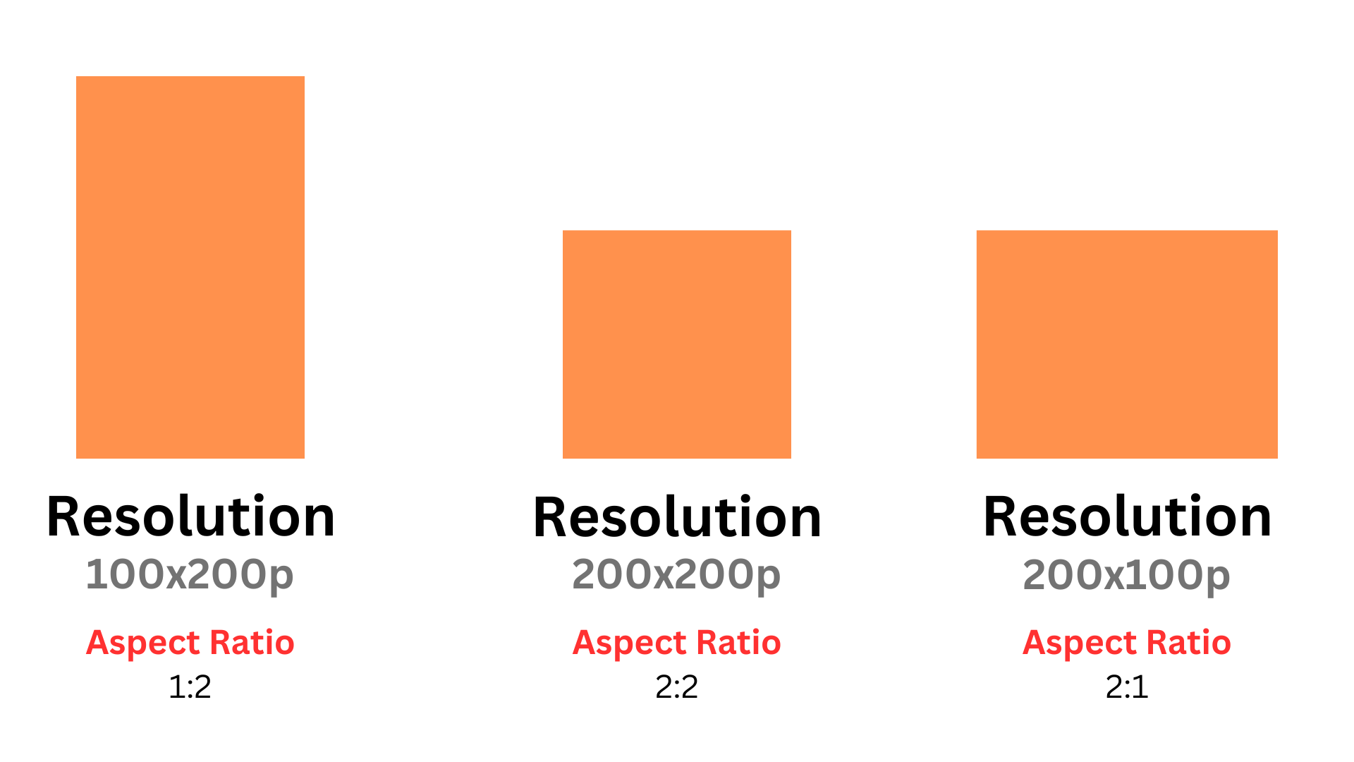
A 1:2 aspect ratio means the height is twice the width. Common examples include 100 pixels x 200 pixels, 450 feet x 900 feet, and 12 tiles x 24 tiles (such as LED panels). This aspect ratio is known as a portrait ratio due to its taller orientation. Any aspect ratio where the height exceeds the width falls into this category.
Other popular portrait ratios include 2:3, 9:16, and 1:5. It's important to note that aspect ratios are independent of the actual size of the image or video. For instance, a 3-foot by 3-foot box has the same aspect ratio as a 1mm by 1mm pixel, both being 1:1, which is classified as a square ratio.
A 2:2 aspect ratio, commonly known as a square aspect ratio, means the width and height of an image or video are equal. Examples include 200x200 pixels, 1m x 1m, or 50 units x 50 units. The 2:2 ratio is popular for social media posts and design elements, ensuring content fits uniformly across various platforms.
A 2:1 aspect ratio, commonly seen in video and cinematic formats, means that the width of the image is twice its height. For example, dimensions like 1000 pixels by 500 pixels (1000x500) or 600 feet by 300 feet maintain a 2:1 ratio, creating a wide-screen effect perfect for immersive viewing. This aspect ratio is part of a group of popular wide or landscape ratios, which include formats like 16:9, 4:3, and 3:1.
Using a 2:1 aspect ratio is particularly beneficial for cinematic videos or widescreen displays, offering a balanced and visually pleasing format. Whether you're adjusting your screen size or finding the best aspect ratio for your media, this calculator helps maintain the perfect visual proportions.
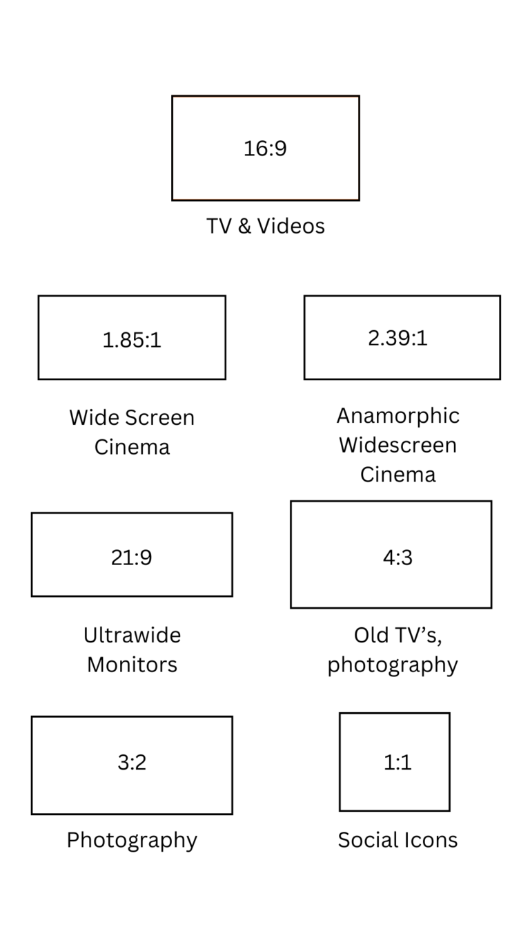

The 16:9 aspect ratio, also known as widescreen, is currently the most widely used aspect ratio for televisions, computer monitors, and mobile devices. It has become the standard due to its suitability for HD, Full HD, 4K UHD, and even 8K UHD content.
The ratio of 16:9 provides an ideal balance for visual display, making it popular for both video production and streaming across platforms like YouTube.
Here is a list of some of the most common 16:9 resolutions that you may encounter or use:
Additionally, there is a range of more detailed resolutions within the 16:9 ratio that span from lower resolutions (such as 896 x 504) to much higher ones, like 5120 x 2880 (5K UHD+)
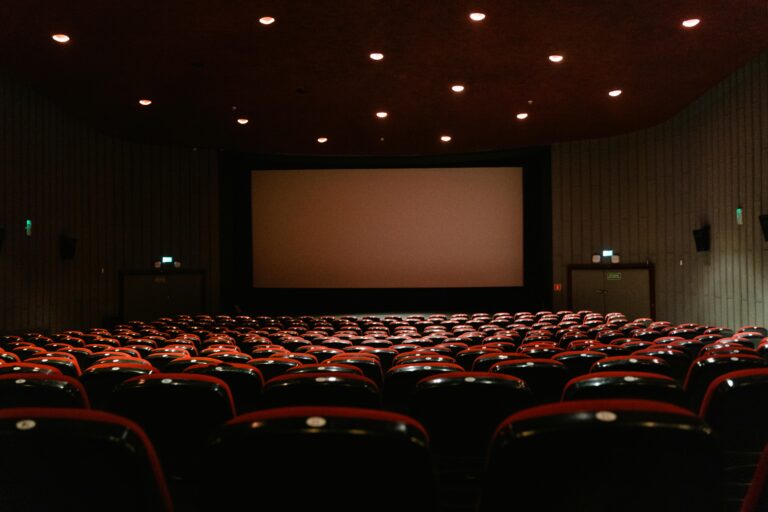
In film, two of the most common aspect ratios are 1.85:1 and 2.39:1, known as widescreen and anamorphic widescreen, respectively. Both are wider than the standard 16:9 aspect ratio, offering a broader field of view. When watching a movie with these ratios on a standard 16:9 TV, black bars appear at the top and bottom due to the wider frame.
Anamorphic widescreen captures a wider image and uses lenses to compress the footage for a standard frame, later corrected during projection. This process results in a more cinematic viewing experience.
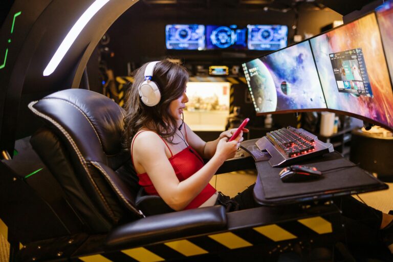
The 21:9 aspect ratio is one of the most popular choices for ultrawide monitors and is often seen in both gaming and productivity setups. This ratio offers a wider and more immersive viewing experience than traditional 16:9 monitors, which makes it perfect for multitasking and gaming enthusiasts alike.
Typically marketed as 21:9, the actual aspect ratio is closer to 64:27 (2.37:1), closely matching the anamorphic widescreen ratio of 2.39:1 used in cinemas. This slight difference allows ultrawide monitors to deliver a more cinematic experience while being practical for daily use.
Resolutions like 3440×1440 (WQHD) and 2560×1080 (Ultrawide FHD) are standard for these displays, offering high-definition quality with a broader field of view.
Ultrawide monitors, especially those with a 21:9 aspect ratio, offer significant advantages over standard widescreen displays. The extra screen real estate makes them ideal for multitasking, allowing users to run multiple applications side by side without the need for a dual-monitor setup.
For gaming, the wider aspect ratio enhances immersion by expanding the player's field of vision, and for movie lovers, it mimics the cinema experience without the black bars, known as "letterboxing."
Some top-rated ultrawide monitors in the market include the LG Ultra Gear 38GN950, with a 38-inch screen and 3840x1600 resolution, perfect for both gaming and professional work. It provides a high refresh rate and a 1ms response time, making it suitable for fast-paced games.
Another budget-friendly option is the AOC CU34G2X, offering a 34-inch curved display with a 3440x1440 resolution, which enhances immersion for gaming and productivity.
For users seeking an even wider experience, the 32:9 aspect ratio monitors like the Samsung Odyssey Neo G9 provide an extreme ultrawide experience with a massive 49-inch display and a 5120x1440 resolution.
These "super ultrawide" monitors are great for professional workflows requiring a vast screen space but may not be as suitable for gaming or media consumption due to the uncommon aspect ratio.
Choosing an ultrawide monitor can revolutionize how you work, play, and watch media. The 21:9 aspect ratio is versatile for gaming, media production, and productivity, while the broader screens like 32:9 are great for extensive multitasking.
With increasing support for high resolutions like WQHD and the introduction of advanced features like HDR and high refresh rates, ultrawide monitors provide a seamless, high-quality visual experience.
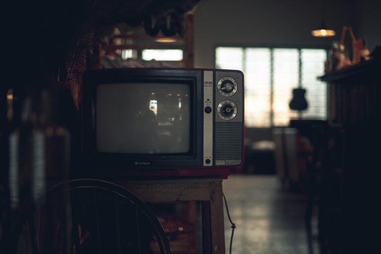
The 4:3 aspect ratio, also known as 1.33:1, was the standard for older television broadcasts and early digital screens before being widely replaced by the 16:9 aspect ratio. This format is still relevant for certain projects, particularly when aiming to evoke a nostalgic or retro feel, as it was a prevalent ratio for TV content until the late 1990s and early 2000s.
Common uses of the 4:3 ratio include photography, where it suits portraits, landscapes, and macro shots, as well as specific video content like documentaries or artistic projects that seek a more intimate or vintage aesthetic. The typical 4:3 resolution seen on older TVs was 640x480 pixels, and it is still a suitable choice for certain platforms or projects that require a more traditional or square-like framing.
In modern contexts, while 16:9 is the prevalent format for HD and online videos (like YouTube and Facebook), 4:3 can still be leveraged effectively in scenarios where a different visual impact is desired. Platforms like Instagram and Pinterest allow for a variety of aspect ratios, including 4:3, to enhance visual appeal based on content and audience consumption habits.

Most photos today use a 3:2 aspect ratio, which has been widely adopted since the era of 35mm film and remains the standard for modern photography. This classic aspect ratio is preferred for its flexibility and ease in cropping for print sizes like 4x6 inches.
It maintains a balanced composition, making it popular for various photography types, from landscapes to portraits. Many photographers find it advantageous as you can easily convert a 3:2 photo into other aspect ratios, such as 1:1, which is often seen on social media platforms like Instagram.
Aspect ratios, expressed as W:H or N:1, are crucial in various digital media and design applications.
Understanding how to calculate aspect ratios is essential for maintaining optimal visual quality across platforms.
Here’s a simple method to calculate aspect ratios both as width to height (W:H) and as a ratio of one dimension (N:1), ensuring your visuals stay sharp and well-proportioned for any use.
Calculating aspect ratios is crucial for maintaining the proper display of images, videos, or any screen-based content. An aspect ratio is represented as W:H, where W is the width and H is the height. To determine the aspect ratio, you divide both the width and height by their Greatest Common Factor (GCF), resulting in a simplified W:H ratio.
The GCF is the largest whole number that can evenly divide both the width and height. It allows you to reduce the ratio to its simplest form, ensuring optimal scaling for your display.
The formula is straightforward: [ Aspect Ratio (W:H) = Width ÷ GCF : Height ÷ GCF ]
Example of Aspect Ratio Calculation
Let’s take an example of a 640x480 resolution. The GCF of 640 and 480 is 160. When you divide the width (640) and height (480) by this GCF:
Therefore, the aspect ratio is 4:3. This is the standard format used for many displays and screens.
While not fractions themselves, calculating aspect ratios follows the same steps as simplifying a fraction. For example, if you need to simplify 550/75, the GCF is 25, so you get 22/3.
This means, if you have a video wall that's 550 pixels wide and 75 pixels high (550x75p), the aspect ratio becomes 22:3.
In essence, the W:H aspect ratio is a simplified, clear representation of a display’s dimensions that ensures consistent and accurate viewing experiences.
Calculating aspect ratios in an N:1 format is straightforward. You simply divide the width by the height, and the result is expressed as “:1” to maintain the ratio.
Formula To calculate an aspect ratio in N:1: [ N:1 = Width / Height : 1 ]
Example For a 1920x1080 resolution:
Aspect Ratio = 1.78:1
Using an aspect ratio calculator can make resizing images and videos easier by maintaining the correct proportions for any medium, whether it's a screen size, social media post, or video project.
By applying these formulas or using an aspect ratio tool, you can ensure that your content retains its intended appearance across various devices and platforms.